The New Arrivals
A UI pattern that is very popular in the web development world is to have a set of cards that are displayed in a grid-like layout. These cards might be products, blog posts, or anything else that you want to promote. Cards often have a cover image, a title, and a description, but they also come in many varieties.
Building a Card Component
Let's start by creating a Card component with some basic markup. In our src directory, create a new file called Card.js and paste the following code into it.:
export function Card() { return ( <article> <img src="https://source.unsplash.com/random/900×700/?fruit" alt="A random fruit from unsplash.com" /> <h3>Fruit</h3> <p> Est autem etiam actio quaedam corporis, quae motus et status naturae congruentis tenet; </p> </article> ); }
Now we can bring in this component into our App.js file. In our App.js file, paste the following code into the App.js file:
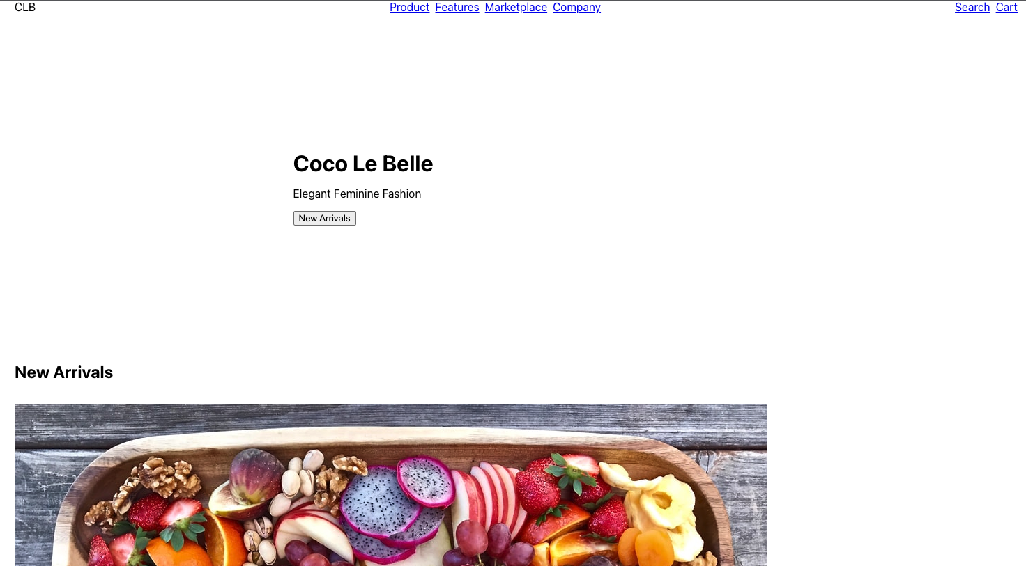
import { Stack } from "@bedrock-layout/stack"; import { Inline } from "@bedrock-layout/inline"; import { Cover } from "@bedrock-layout/cover"; import { Center } from "@bedrock-layout/center"; import { Subscribe } from "./Subscribe"; import { Menu } from "./Menu"; import { Card } from "./Card"; function App() { return ( <Stack gutter='size3'> <Cover minHeight="50vh" gutter='size3' top={<Menu />}> <Center maxWidth="40rem"> <Stack as="header" gutter='size3'> <h1>Coco Le Belle</h1> <p>Elegant Feminine Fashion</p> <Inline gutter='size3'> <button>New Arrivals</button> </Inline> </Stack> </Center> </Cover> <Stack gutter='size7'> <h2>New Arrivals</h2> <Card /> </Stack> <Center centerText> <Subscribe /> </Center> </Stack> ); } export default App;
Your browser should now show something like this:
Typically in a card we want to do two things. One, we often want to set the image's aspect-ratio to fit the design, croping the image so that it fits in the desired aspect ratio. The other thing we typically want to do is add padding around the either the text or the whole card itself. To accomplish these two goals, we can use the Frame and the PadBox primitives.
So let's start by downloading the the Frame and the PadBox primitives:
yarn add @bedrock-layout/frame @bedrock-layout/padbox
And then let's update our Card.js file to look like this:
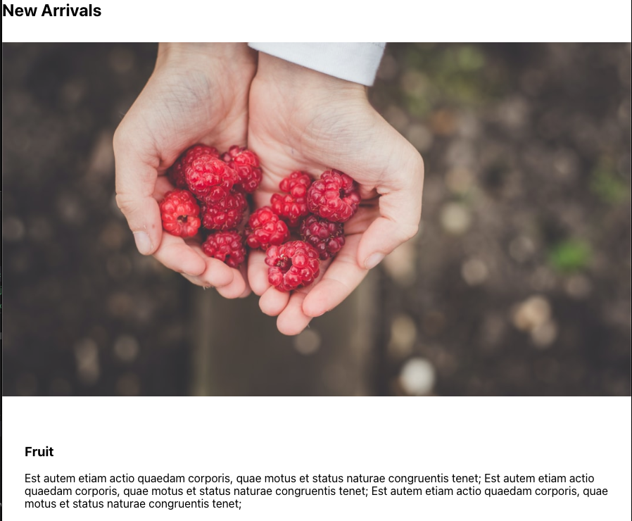
import { Frame } from "@bedrock-layout/frame"; import { PadBox } from "@bedrock-layout/padbox"; import { Stack } from "@bedrock-layout/stack"; //simulate text of various lengths function randomLoremIpsum() { const string = "Est autem etiam actio quaedam corporis, quae motus et status naturae congruentis tenet;"; return Array.from( { length: Math.floor(Math.random() * 6 + 1) }, () => string ).join(" "); } export function Card({ title }) { return ( <Stack as="article" gutter='size3'> <Frame ratio={[16, 9]}> <img src={`https://source.unsplash.com/random/900×700/?${title}`} alt="A random fruit from unsplash.com" /> </Frame> <PadBox padding="size5"> <h3>{title}</h3> <p>{randomLoremIpsum()}</p> </PadBox> </Stack> ); }
Now are Card takes a title prop and displays a title and a random image based off of that title. It will also generate a random lorem ipsum as the text.
now we can update our App.js file to add a Fruit to the title prop of the Card component and see what happens:
A Grid of Cards
We have a Card component that we can use to display a card. Now we want to display them in a grid. There are a few options for this using Bedrock Layout Primitives. The correct one depends upon the type of layout you want to use. Let's try all 3 options and you can decide which option you like the best.
First, we will need to install the ColumnDrop, the Grid, and the MasonryGrid components:
yarn add @bedrock-layout/column-drop @bedrock-layout/grid @bedrock-layout/masonry-grid
Let's start by adding the ColumnDrop component to our App.js file:
import { Stack } from "@bedrock-layout/stack"; import { Inline } from "@bedrock-layout/inline"; import { Cover } from "@bedrock-layout/cover"; import { Center } from "@bedrock-layout/center"; import { ColumnDrop } from "@bedrock-layout/column-drop"; import { Subscribe } from "./Subscribe"; import { Menu } from "./Menu"; import { Card } from "./Card"; const cards = ["Fruit", "Bikes", "Clothes", "Shoes", "Computers"]; function App() { return ( <Stack gutter='size3'> <Cover minHeight="50vh" gutter='size3' top={<Menu />}> <Center maxWidth="40rem"> <Stack as="header" gutter='size3'> <h1>Coco Le Belle</h1> <p>Elegant Feminine Fashion</p> <Inline gutter='size3'> <button>New Arrivals</button> </Inline> </Stack> </Center> </Cover> <Center> <Stack gutter='size7'> <h2>New Arrivals</h2> <ColumnDrop gutter='size3' minItemWidth="20rem"> {cards.map((title) => ( <Card key={title} title={title} /> ))} </ColumnDrop> </Stack> </Center> <Center centerText> <Subscribe /> </Center> </Stack> ); } export default App;
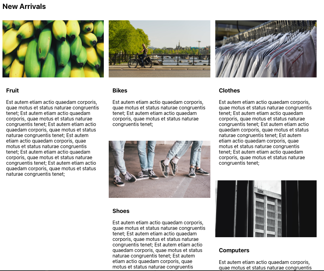
Your browser should now show the following:
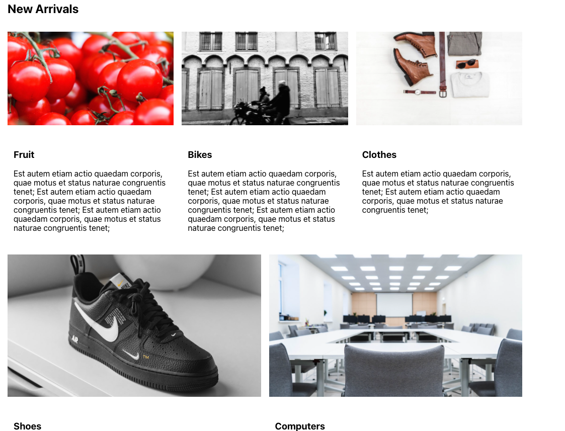
The above picture show the cards being optimized to the number of columns that fit the container, based on the minItemWidth set on the ColumnDrop component. When a column drops down to a new row, the precious row's column count does not impact the new row's column count. By default, it will stretch each card, but you can also set the ColumnDrop to have noStretchedColumns set to true to prevent this.
The next option is to use the Grid component. So let's update our App.js file to use the Grid component. We will also need to import the Grid component
import { Grid } from "@bedrock-layout/grid";
Then we can update replace the ColumnDrop component with the Grid component:
<Grid gutter='size3' minItemWidth="20rem"> {cards.map((title) => ( <Card key={title} title={title} /> ))} </Grid>
Your browser should now show the following:
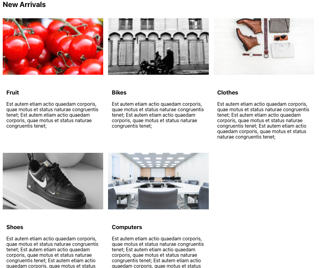
Unlike the ColumnDrop the Grid will keep a consistent column count across rows. The column count is based on the minItemWidth set on the Grid component.
The final option is to use the MasonryGrid component. So let's update our App.js file to use the MasonryGrid component. We will also need to import the MasonryGrid component,
import { MasonryGrid } from "@bedrock-layout/masonry-grid";
Then we can update replace the Grid component with the MasonryGrid component:
<MasonryGrid gutter='size3' minItemWidth="20rem"> {cards.map((title) => ( <Card key={title} title={title} /> ))} </MasonryGrid>
Your browser should now show the following:
The MasonryGrid component will keep a consistent column count across rows. But instead of vertically stretching each card, to fit the tallest card in the row, it will keep the cards height the same. Then each card is placed as densly as possible. This layout pattern is often called the Pintrest layout since it is made popular by Pinterest.
It's important to note that all three grid layouts will optimize based on it's container, eventually creating a stacking layout when the container is too small. The difference between the three layouts is how the columns and rows are distributed.
What Next?
In just a few short lessons we now a well laid out landing page. You can see the power of how easy it is to create so many complicated layouts with these simple layout primitives. I recomend you check out the rest of the Bedrock Layout Primitives. Also check out the CSS only version of the Bedrock Layout Primitives in case you are interested in using them in a project that is not using React.
If you are interested in contributing you can learn more about contributing code to Bedrock or you can open an issue any time at the GitHub repo.
Thank you again for taking the time to learn more about Bedrock Layout Primitives. I hope you enjoyed it.