The Menu Component
After the stack layout, the next most common layout pattern on the web is putting one thing next to another in the inline direction. Putting two or more things has never been that simple. In the past, this was partially due to the lack of layout options in CSS. Currently, it mostly comes down to the fact that laying out items inline is only one of the variables we need to consider.
Do we want the items to grow or shrink? What about responsiveness? Should the items wrap or switch to a stack layout? There are so many questions that need to be answered about inline layouts. Bedrock Layout has solutions for many of these problems, but for now, we are going to focus on two of them: Inline and InlineCluster.
Let's Get Started
In this lesson we are going to build a menu for our landing page.
Let's start by creating a new file called Menu.js and add the following code:
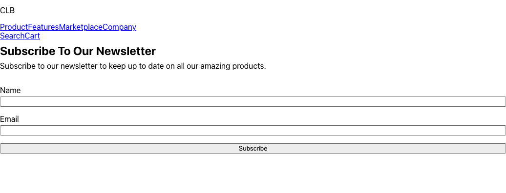
export function Menu() { return ( <div> <p>CLB</p> <nav> <a href="/#">Product</a> <a href="/#">Features</a> <a href="/#">Marketplace</a> <a href="/#">Company</a> </nav> <div> <a href="/#">Search</a> <a href="/#">Cart</a> </div> </div> ); }
We can now import our Menu component into our App.js file:
import { Stack } from "@bedrock-layout/stack"; import { Subscribe } from "./Subscribe"; import { Menu } from "./Menu"; function App() { return ( <Stack gutter='size3'> <Menu /> <Subscribe /> </Stack> ); } export default App;
Your browser should now show the following:
Adding the Inline and InlineCluster
Let's start by installing the Inline and InlineCluster components:
yarn add @bedrock-layout/inline @bedrock-layout/inline-cluster
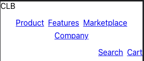
And then let's start by adding the Inline component to our Menu
import { Inline } from "@bedrock-layout/inline"; export function Menu() { return ( <Inline stretch={1} gutter='size3'> <p>CLB</p> <Inline gutter='size3' justify="center"> <a href="/#">Product</a> <a href="/#">Features</a> <a href="/#">Marketplace</a> <a href="/#">Company</a> </Inline> <Inline gutter='size3'> <a href="/#">Search</a> <a href="/#">Cart</a> </Inline> </Inline> ); }
Now we can restart the app and your browser should show the following:

In the above Menu component, we are taking advantage Inline's gutter prop to set the spacing. We are also using it's stretch prop to set the 2nd child to stetch itself so it takes up all remaining space. We are also using the justify prop to center middle nav element.
Responsive Layouts
Typically, inline layouts need to be able to be responsive to the screen size. There are a few solutions that one can adopt to make the layout responsive. One is to allow the items to wrap and cluster according to the justification setting, much like how words in a paragraph will wrap and cluster. This is what the InlineCluster primitive is used for. It will automatically wrap the children to a new row if there is not enough space in the inline direction, and it will cluster at the start, center, or end, depending on what the justify prop is set to.
Another typical pattern is to switch from an inline layout to a stack layout if the inline size is smaller than a set threshold. The Inline primitive has a switchAt prop that lets you set a threshold that if it's width is below that threshold, it will switch to a stacked layout.
So let's make one final update to our menu:
import { Inline } from "@bedrock-layout/inline"; import { InlineCluster } from "@bedrock-layout/inline-cluster"; export function Menu() { return ( <Inline stretch={1} gutter='size3' switchAt="40rem"> <p>CLB</p> <InlineCluster gutter='size3' justify="center"> <a href="/#">Product</a> <a href="/#">Features</a> <a href="/#">Marketplace</a> <a href="/#">Company</a> </InlineCluster> <Inline gutter='size3' justify="end"> <a href="/#">Search</a> <a href="/#">Cart</a> </Inline> </Inline> ); }
Now if we resize to a small mobile screen size, it will look something like this:
In the next section we will start to fill out our landing page by adding a Hero section using the Cover component. I'll see you there.